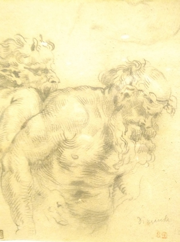
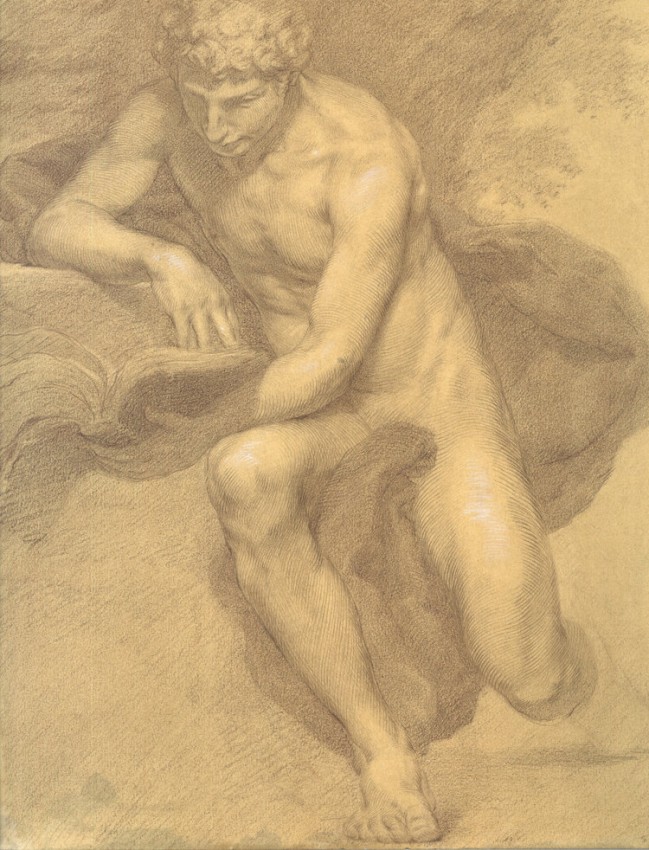
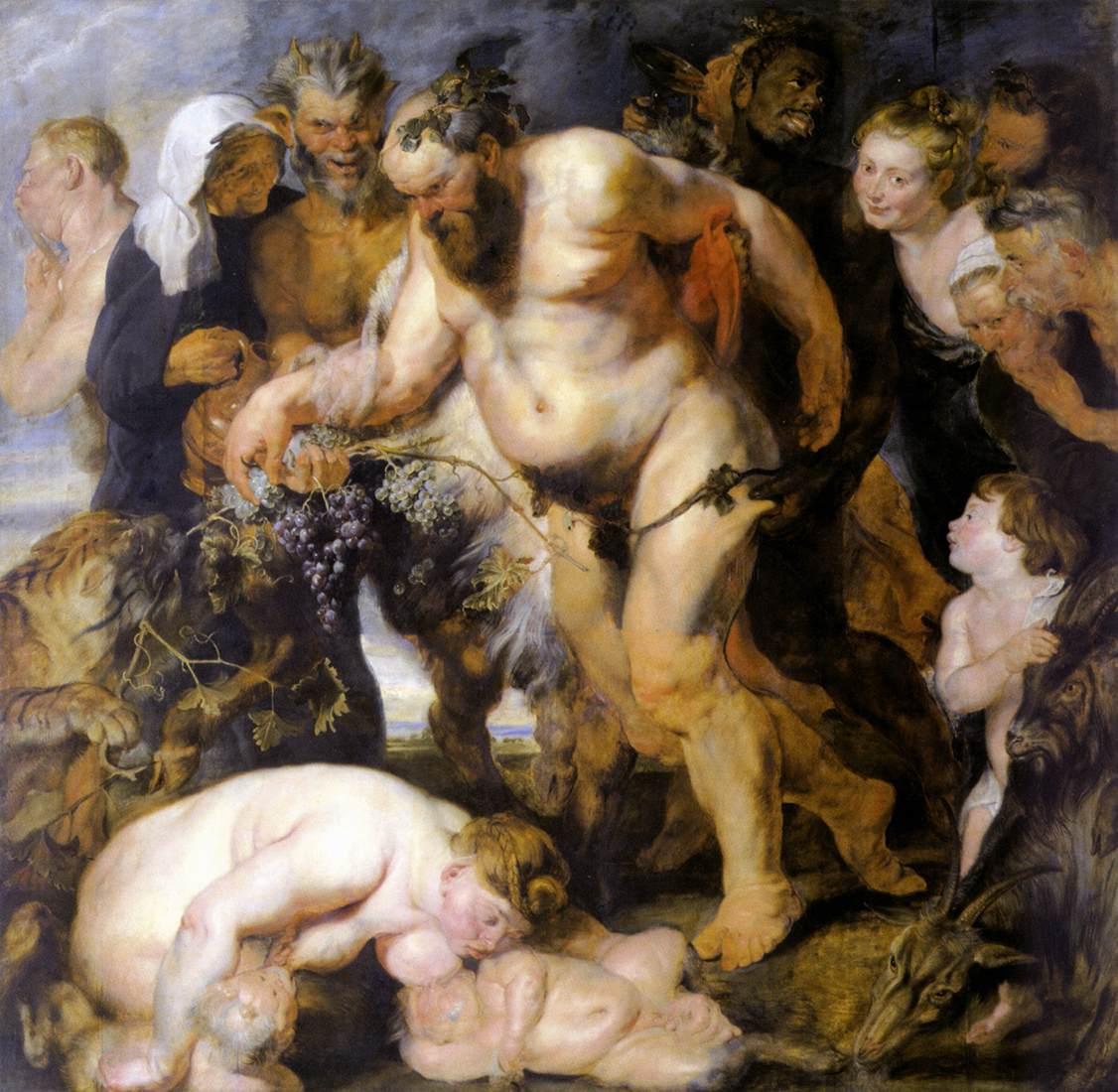
Delacroix, Drunken Silenus after Peter Paul Rubens (detail), 1840. Graphite on paper. Metropolitan Museum of Art, promised gift from the Karen B. Cohen Collection.
A legendary rivalry existed between the two megastars of nineteenth-century French painting: the arch-Romantic Eugène Delacroix (1798-1863)—the subject of an exhibition now at the Metropolitan Museum, through November 12—and the inveterate classicist Jean-Auguste-Dominique Ingres (1780-1867).1 But on one thing they agreed: Drawing is the essential foundation of art.
As Ingres famously declared, “Drawing is the probity of art.”2 Delacroix’s verbal acknowledgment of that central fact was less direct. “Colour always occupies me,” he once confided, “but drawing preoccupies me.” His conviction regarding the fundamentality of drawing to his art was evident in practice, however, as the Met’s show demonstrates.
Entitled Devotion to Drawing, the exhibition presents 130 drawings from the Karen B. Cohen Collection. The collection (promised as a gift to the museum) includes diverse examples of Delacroix’s lifelong and wide-ranging engagement with graphic art.
Often Surprising Models
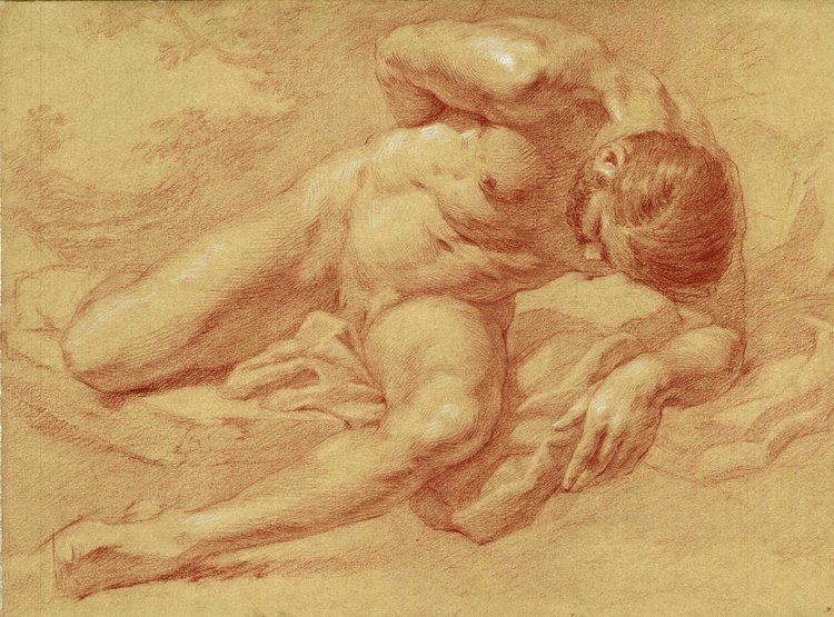
There is nothing remarkable about the exhibition’s first image—a typically academic male nude drawn from life by the young Delacroix as a student under Pierre-Narcisse Guérin.
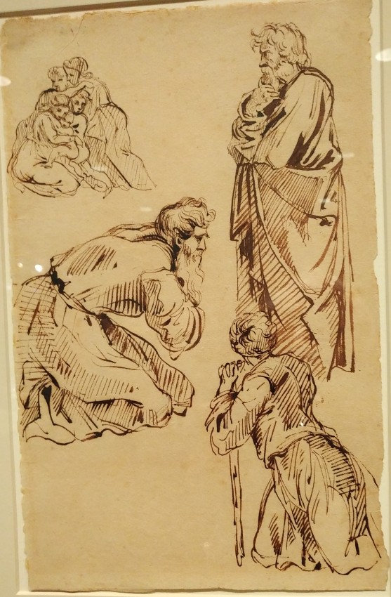
Delacroix, Figures from Raphael’s Vatican Loggia, ca. 1833–35. Pen and iron gall ink. Metropolitan Museum of Art, promised gift from the Karen B. Cohen Collection.
What is surprising is that the artist frequently turned to classical models in later years, even after his own much freer style had evolved. He made drawings not only of antique sculptures and coins but also after prints of ancient reliefs. And while he had the greatest stylistic affinity with the baroque master Rubens—in whose work he saw “expression carried to the utmost limit” (as in The Drunken Silenus and the Adoration of the Magi)—he also admired the classical “perfection of drawing, grace, and composition” he found in Raphael, as attested by several drawings after prints of the latter’s work. In his copying, Delacroix rarely drew entire compositions. In the example shown here, he selected three male figures and a group of women and children from four different Raphael frescoes for the Vatican. Using reproductive prints as his direct source, he copied freely, adapting the engraving into his own drawing style. In the curator’s view, the isolation of these figures from their context suggests he was mainly interested in their various poses.
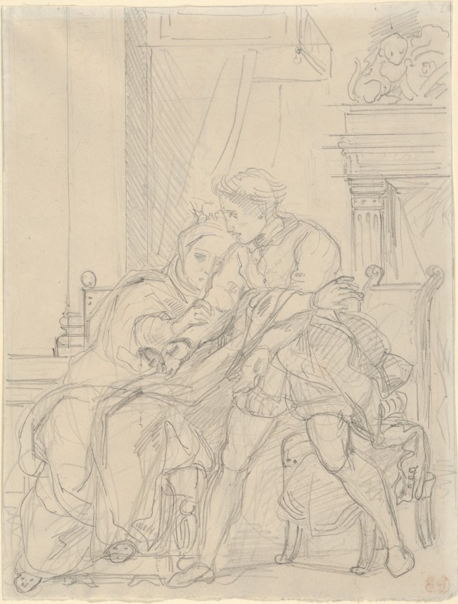
Delacroix, Hamlet Reproaches His Mother, ca. 1834. Preparatory pencil sketch for lithograph. Metropolitan Museum, gift from the Karen B. Cohen Collection.
More fuel for Delacroix’s fertile imagination came from drawings based on countless other sources, ranging from English caricatures and medieval arms and tomb effigies to wild animals at the zoo, picturesque scenes from his travels, and flayed cadavers. In addition, he continually used drawings as the basis for important commissions and projects, from works of religious art to ambitious series of lithographs illustrating literary classics such as Goethe’s Faust and Shakespeare’s Hamlet.
All in all, Delacroix’s example merits emulation by today’s would-be artists and art teachers, too many of whom have forgotten that drawing is indeed the foundation of visual art. A notorious example is Damien Hirst—one of today’s leading “artists”—who declared in an interview with talk show host Charlie Rose that the one thing he regretted being unable to do in his work is “represent the three-dimensional world on a two-dimensional surface.” Nonetheless, he has the chutzpah to call himself an artist, and the artworld lionizes him as such—along with unthinking journalists like Rose, who fawningly follow suit. Would that this exhibition might prompt some rethinking on that score!
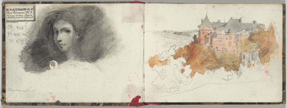
Delacroix, Normandy Sketchbook, 1829. Graphite and watercolor. Metropolitan Museum, promised gift from the Karen B. Cohen Collection.
Significantly, Ingres added: “To draw does not mean simply to reproduce contours; drawing does not consist merely of line: drawing is also expression, the inner form, the plane, modeling.” Probité, the French term used by him, could also be translated as “integrity” or “truth.” ↩
For today’s art establishment (including once-conservative institutions such as the Metropolitan Museum of Art and the Morgan Library), contemporary art must be radically “new”—the more unprecedented or deskilled in form and transgressive or inscrutable in content the better.1 An intrepid group of dedicated contemporary artists begs to differ, however. They are the largely neglected painters and sculptors known as Classical Realists. Devoted to continuing in the grand tradition of Western art since the Renaissance, they spend years honing their craft, striving to be worthy of the estimable predecessors who inspire them.2
The Unbroken Line: Old and New Masters[online catalogue], a modest exhibition at the Robert Simon Fine Art gallery (a stone’s throw from the Met) through June 8, begins to give them their belated due at last. As the title implies, it juxtaposes work (mostly portraits and still lifes) by faculty and recent graduates of the Grand Central Atelier with pre-modernist paintings and drawings from the gallery. (GCA is one of the many ateliers that have been created in recent decades to provide the sort of classical training generally missing from academic BFA and MFA programs these days.) The juxtaposition demonstrates that these relatively young artists clearly hold their own alongside the Renaissance and Baroque work Robert Simon specializes in.
Simon, by the way, is the art historian who discovered and identified the lost Salvatore Mundi by Leonardo that sold for a record-breaking sum last year. So he knows a thing or two about the finer points of “fine” art. The idea for this unprecedented exhibition came to him after he had enrolled as a student at Grand Central to improve his understanding of the technical side of painting, a peripheral aspect of his training as an art historian. The quality of the work he saw at GCA so impressed him that he proposed this show, which he curated with two GCA artist-instructors—Colleen Barry and Anthony Baus (both b. 1981). Barry and Baus selected works from the atelier, which Simon then paired with “sympathetically similar” images from his stock.
These Comparisons Are Not Odious
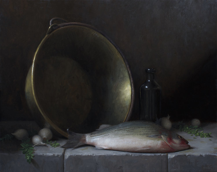
Justin Wood, Sea Bass, 2018.
An especially apt pairing was of Sea Bass by Justin Wood (b. 1982)—at the right—with A Still-Life “Pronk” by Joris van Son (b. 1623). For me, the recent work loses nothing by the comparison, and is even more appealing in its relative simplicity—as good as anything by the still-life master Chardin. Though I’ve never been a fan of dead-fish paintings, Wood’s sea bass is compelling in its plump iridescence, as is the huge brass pot standing ready to receive it. Two other still lifes by Wood in the show are also of impressive quality.
A more unexpected juxtaposition placed David—an unpretentiously secular contemporary portrait by Jacob Collins (b. 1964), GCA’s founding force—next to Christ Blessing by Vittore Carpaccio (b. ca. 1465-70). Notwithstanding the works’ vastly different significance, they demonstrate the riveting power of a direct frontal gaze.
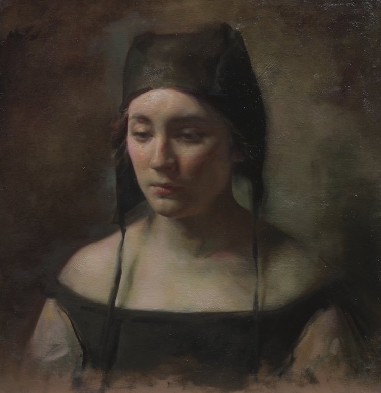
But the strongest suit of the show is portraiture. Especially fine are the examples by Barry—most notably, Black Hat and Portrait of the Artist’s Mother—sensitive depictions of pensive youth and somewhat worn and wary age. Also striking are Portrait of a Young Woman by Rachel Li (b. 1995) and an untitled portrait by Will St. John (b. 1980), side by side with a similarly toned seventeenth-century Bolognese Portrait of a Boy.
Despite their evident similarities with earlier art, each of the new works is a unique take on aspects of humanity or things we value. Most significantly in today’s context, each subject is endowed with a degree of gravitas. Moreover, these paintings and drawings are as fresh and important now as the comparable works from the past were in their day. Only the foolish modernist insistence on originality at all costs would prompt the dismissive judgment “It’s been done” regarding such contemporary work in a traditional vein.
Can it be a hopeful sign that curators from the Metropolitan Museum were spotted in the crowd at the show’s opening? Might they have carried word back to their esteemed institution suggesting that its view of “contemporary art” needs revising?
The Establishment View of Contemporary Art
As one might expect, the establishment view—in sharp contrast with the work shown at Robert Simon—is widely shared by art critics, including members of the International Association of Art Critics (AICA), to which I was recently admitted. Last month I attended the annual meeting of AICA’s U.S. section, at the offices of The Brooklyn Rail. I alternated between feeling like Daniel in the lion’s den and the fox in the henhouse.
On the way to the meeting from the subway station, a longtime AICA member, Suzaan Boettger, struck up a conversation with me. An art historian who teaches at Bergen Community College, she specializes in “environmental art,” having written the book Earthworks: Art and the Landscape of the Sixties—regarded as the “definitive history” of such work by the New York Times Book Review. I, on the other hand, consider “earthworks” to be one of the sixties’ anti-art phenomena, a topic for sociology perhaps but not for “art history.”
Other AICA members I met included Kaoru Yanase, visiting from Japan, where she serves as chief curator of the Nakamura Keith Haring Collection. On its website, Haring’s work is said to embody “the importance and preciousness of life, containing strong themes of peace, freedom, hopes, and dreams of humanity.” Nothing is said of the extent to which Haring’s schematic, cartoonish, street-art style undercuts the seriousness of such themes, however.
Another member, by chance seated near me at the group’s business meeting, was Norman Kleeblatt, who served for many years as a curator at the Jewish Museum in New York. As it happens, I had commented critically on a 2002 exhibition organized by him featuring “conceptual art” (Mirroring Evil: Nazi Imagery / Recent Art). My article was entitled “Anti-Art Is Not Art” (What Art Is Online, June 2002).
Also telling was the cover of the latest issue of the Rail, depicting a minimalist installation by the German sculptor Wolfgang Laib. Inspired by Eastern religions and philosophy, his work is at the inscrutable end of the contemporary art spectrum.
But perhaps the most unsettling indication of the artworld’s prevailing inclinations is the work of the two painters featured in a panel discussion on art writing at the AICA meeting, which was moderated by the Rail’s co-founder Phong Bui.
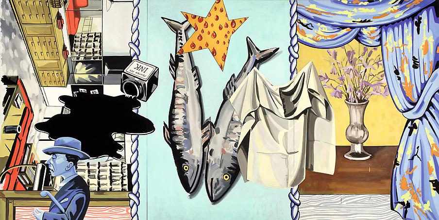
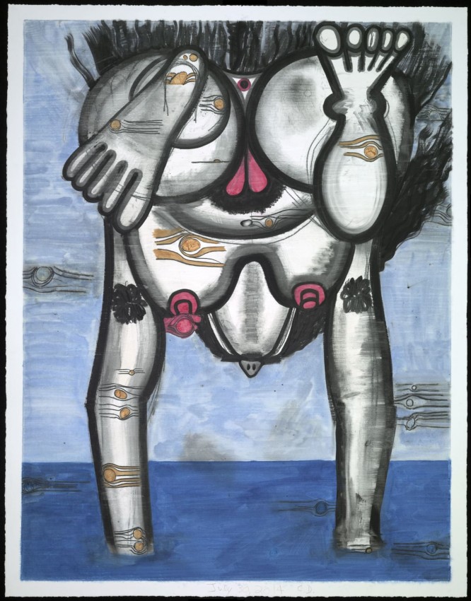
They were David Salle, “who helped define postmodern sensibility,” and Carroll Dunham, whose paintings even the Los Angeles Times has considered “vulgar beyond belief.”
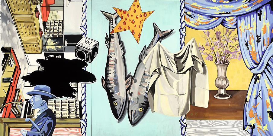
That prompts me to ask whose work should be more highly regarded—David Salle’s “conceptual” painting featuring dead fish, say, or Justin Wood’s still life of the same subject? Carroll Dunham’s vision of humanity or that of Anthony Baus? My answer is too obvious to need stating.
Unlike Damien Hirst—who once lamented never having learned to represent the three-dimensional world on a two-dimensional surface—these artists have mastered that foundational skill. For more on Classical Realism, see “The New Dawn of Painting” by Louis Torres (Aristos, March 1986), my “R.H. Ives Gammell” (Aristos, May 1990), “The Legacy of Richard Lack” by Louis Torres (Aristos, December 2006), and “Reflections on ‘Classical Realism’” by Jacob Collins (Aristos, November 2007). ↩
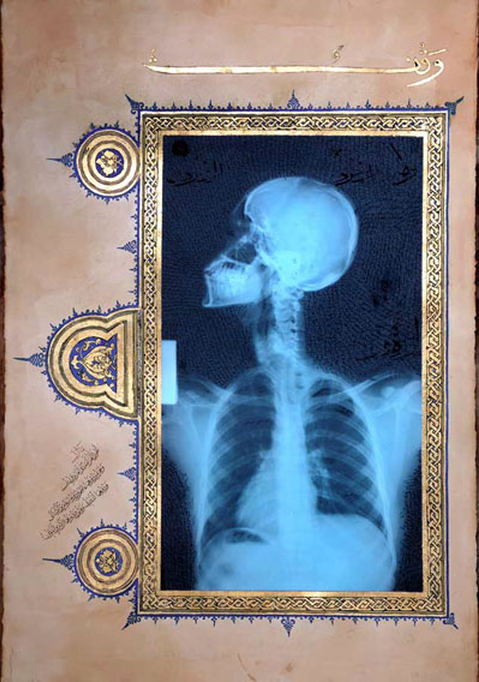
Ahmed Mater, Waqf Illumination III, 2009. Gold leaf, tea, pomegranate, Dupont Chinese ink, and offset X-Ray film print on paper. 155 x 105 cm. Beauchamp Club Collection.
The founding and activities of Saudi Arabia’s MiSK Art Institute ought to be good news for art lovers. As the first institute of its kind in the formerly arch-conservative Saudi kingdom, it aims to support emerging Saudi artists and increase their interaction and visibility both within and beyond the kingdom. Operating under the auspices of the non-profit MiSK Foundation established by Crown Prince Mohammed bin Salman, it is part of his bold plan to bring Saudi Arabia into the 21st century by educating its youth and fostering their creative potential. Who could quarrel with such a laudable project?
The problem, as in many laudable projects, lies in the execution. Sadly, the MiSK’s nascent efforts mainly reveal the stranglehold that postmodernist pseudo art—and the confused thinking behind it—has on the global artworld.
The Work of Ahmed Mater
Not surprisingly, the person chosen to head the institute is the Saudi who has probably gotten the most attention in the international artworld, Ahmed Mater [more]—an exhibition of whose work is now at the Brooklyn Museum (Ahmed Mater: Mecca Journeys). Trained as a physician, not an artist, Mater combines elements of both spheres in his work. One of his most acclaimed pieces is his Illuminations series, a part of which is pictured above.
A website featuring Mater’s Illuminations XI & XII bills itself as a platform “for significant works from some of the world’s most engaging and challenging contemporary artists,” which allows each work “to speak boldly for itself.” But do Mater’s Illuminations—consisting of human X-ray images framed by traditional Arabic decorative and calligraphic motifs inspired by Qur’anic manuscripts—really speak for themselves? Or do we need the dense verbal explanations provided by Mater and others to understand his intention? Of his X-Ray – Talisman 3 (acquired by the British Museum in 2009), for example, curator Venetia Porter concludes:
through these works, Mater illuminates Islamic tradition to show its close relationship to the faith-driven and spiritual, making manifest a dynamic complexity that has been diminished and negated by the strictures of contemporary religious systems.
Really? Such verbiage cannot dispel my spontaneous response to the works themselves. I’m simply repelled by the jarring juxtaposition of its disparate visual elements, and have no desire to linger long enough to find out what they are supposed to mean. On that count, they have failed what is for me the first test of a successful work of art: to capture and hold one’s attention on its own terms, without the crutch of verbal explanation.
Writing about Mater’s X-Ray 2003 (the first of his X-ray pieces), Linda Komaroff, curator of Islamic art at the Los Angeles County Museum of Art, tellingly declares that “it may be up to future generations of art historians to determine which heading or label to apply to [Mater’s] art.” Yet she maintains that he “demonstrates the very special ability to speak in a universal voice.” Speaking in a “universal voice” implies communicating on its own in purely visual terms, however. Owing in part to his failure to do that, I for one art historian would place Mater’s work in the category of postmodernist pseudo art.
Another high-profile piece that I’d place in the same category is Mater’s Evolution of Man series. As described on his website: “A silhouetted gas pump mutates into a human X-ray, a gun to its head, before morphing back again.” It is “a succinct, urgent warning against an over-reliance on the petrodollar, a destructive addiction Mater [has] witnessed in Saudi Arabia.”
Ahmed Mater, Evolution of Man, 2010.
Indeed it is, and unlike the Illuminations series, its meaning could probably be guessed by most viewers, without instruction. But like other “conceptual” pieces, the generic idea matters more than its particular manner of execution. Although the New York Times has suggested that the X-ray is of Mater himself, the viewer cannot know that directly from the image. It is dehumanized and impersonal in its effect. An X-ray of anyone else would have served the idea as well. As a warning sign, I get it. But it appeals to my intellect, not to my heart. To that extent, it fails as art (not to mention the non-artistic nature of the X-ray images themselves).
Yet another “conceptual” piece by Mater that, however clever, suffers from similar shortcomings in my view is Magnetism. Anyone who knows of the Kaaba (Islam’s holiest site, which draws millions of pilgrims during the annual Hajj) is likely to guess the significance of the work’s magnetic black cube surrounded by concentric circles of iron filings. But the piece’s abstract, mechanical nature gives no access in personal human terms to the nature of that experience, and therefore (unlike a work of genuine art) offers no reason to contemplate it further once the idea has been grasped.
Recent Exhibition in New York
In conjunction with the Crown Prince’s recent visit to the U.S., the MiSK Institute sponsored a small Contemporary Saudi Art exhibition in New York for four days late last month at the prestigious Phillips auction house on Park Avenue—preceded by one on March 21st at the John F. Kennedy Center in Washington, D.C. In my view, the works shown largely suffered from the same deficiencies as those noted above. With two exceptions, they were all in the spurious postmodernist vein of “conceptual art.”1
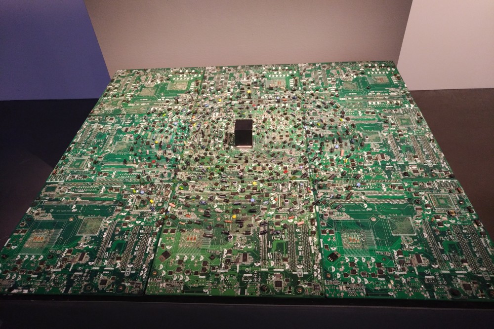
Amr Alngmah, Digital Spirituality.
Amr Alngmah’s Digital Spirituality— an installation in which a central cube is surrounded by concentric circles of electronic components—echoed the theme of Mater’s Magnetism, in an equally depersonalized manner.
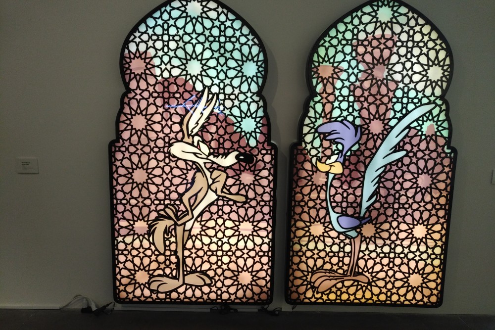
Rashed Al Shashai, Beep Beep, 2015. Acrylic light box.
Another work, Rashed Al Shashai’s Beep Beep diptych, set the Looney Tunes cartoon characters Wile E. Coyote and the Road Runner against a traditional pattern of Arabic latticework. A provocative juxtaposition, but its point eluded me. Was it an ironic allusion to the universal rat race? Whatever its intent, can it have any but a fleeting effect?
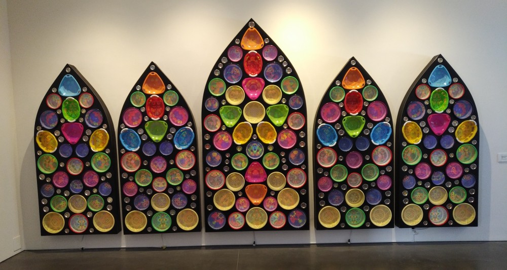
Al Shashai’s Heaven’s Door also combined decorative with “conceptual” elements. At a distance it is a colorful and visually appealing installation of five arches. On closer examination, however, one sees that it is an assemblage of banal food and sink strainers. It was meant, we were told, to say something about the filter through which one enters heaven. But once again, a metaphor conveyed through such gimmicky means functions, at best, on a superficial intellectual level, not at all on a deeply emotional one.
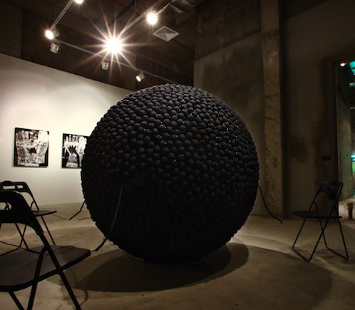
Ahmad Angawi’s Street Pulse was a wholly “conceptual” piece which had no visual appeal at all. A meteor-like large sphere made up of microphones, it is described as
an ongoing interactive piece that will evolve with the contribution of different people, whose voices will be recorded from different locations in the Arab world. . . . The microphones offer an opportunity to speak and express oneself. The aim? ‘Evolution, not revolution’. . . . The project acts as an electrocardiogram machine, which instead of measuring the vitals of the body, would measure the pulse of the street.
A commendable social aim, but electrocardiogram machines are medical devices, not works of art.
The website from which the description of Angawi’s piece is taken belongs to Edge of Arabia— a non-profit collaborative founded in 2003 to foster dialogue and exchange between the Middle East and the West through free exhibitions, publications, and public programming. One of its co-founders is the British artist Stephen Stapleton (not to be confused with Steven Peter Stapleton), who is also engaged in communications for the MiSK Art Institute. In a TEDx talk about Edge of Arabia, Stapleton has avowed his belief in art’s “power as a universal language instrumental in bringing about change in the world.” What he apparently fails to see, however, is that the universal language of visual art consists of cross-culturally meaningful imagery—not postmodernist “conceptual” pieces that require verbal commentary to be understood.
Saudi Women’s Art and Islamic Aniconism
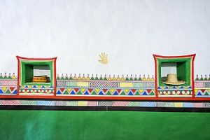
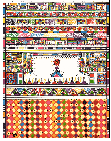
A highly commendable aspect of recent developments in Saudi art is the effort to give women a more active role. As it happens, the two pieces that I found most visually striking in the New York exhibition were by women working in the Al-Qatt tradition [more] of domestic interior decoration, from the Asir region of southwestern Arabia. They were Our Mother’s House and this large collaborative mural:
Al-Qatt Mural, Contemporary Saudi Art exhibition, New York, March 2018.
Their intricate multi-colored patterns of geometric shapes gave the eye something to delight in.
For the women who create them, we were told, Al-Qatt decorations can encode personally meaningful references. According to one account, Al-Qatt
expresses a long relationship between people and their natural environment, showing complex scenes that narrate the stories of their family, culture, environment, rituals and agriculture.
Turkish miniature illustrating one of the Fables of Bidpai, ca. 1589. British Museum, Add. 15153, f.114.
In the absence of imagery, however, such references are entirely inaccessible to outside viewers. In that respect, the Al-Qatt tradition contrasts sharply with works of narrative visual art in other regions of the Islamic world. See, for example, the Turkish miniature at the right, illustrating one of the Fables of Bidpai.
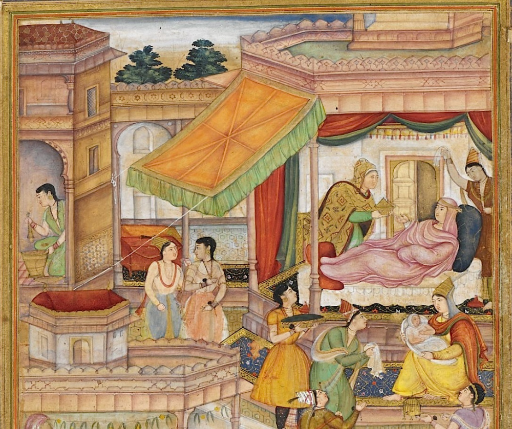
Persia had an especially rich history of narrative art, as exemplified by this image depicting an event in the early life of the Emperor Akbar:
The fundamental difference between decorative and pictorial art of course raises the thorny issue of Islamic aniconism. In Saudi Arabia, the dominant Sunni tradition has until recently maintained a strict ban on figurative representation (based not on the Qur’an itself but on related hadith), whereas no such prohibition was observed by the Shi’a in Persia or even by the Hanafi branch of Sunni Islam found in Turkey.
In recent years, the Saudi ban on imagery has begun to be relaxed, however—primarily through photographic media. A featured work in the New York exhibition, for example, was a “performance art” piece entitled I Went Away and Forgot You, by Dana Awartani. In the preparatory phase of the work, Awartani creates a meticulous floor installation of sand she has hand-dyed with local pigments and arranged in a geometric pattern resembling traditional floor tiles once common in Arabic homes. The second part of the work is a video showing her sweeping away one of her floor pieces.
When a version of the work was exhibited at the 2017 Jakarta Biennale, it was described as “a call to celebrate the beauty of traditional Islamic design and architecture” and an implicit criticism of the wealthy Saudis who discarded that native aesthetic for more modern, Western modes of interior decoration, “leaving no trace of their cultural identity.”
Awartani was said to be “celebrating and preserving the timeless language of geometric aesthetics as a universal language of beauty and harmony.” Here again, however, the essential nature of the decorative/design arts is misconstrued. While geometric designs can indeed create a sense of abstract “beauty and harmony,” they do not signify something particular in the way pictorial art can, and therefore do not constitute a “timeless language,” properly speaking.
Awartani’s video raises a related question regarding figurative representation. Remarkably, given the traditional conservatism of Saudi society, it shows her with her face uncovered and her long dark tresses freely flowing (though she is modestly garbed in a long black dress). If such freedom can be permitted in a video, why hasn’t it occurred in Saudi painting? One obvious answer is that, unlike photography and video, figurative art requires a long-honed skill that has been totally absent in Saudi Arabia, owing to its strict aniconism.
The Future of Saudi Art
In a panel discussion at the Phillips in connection with the New York exhibition, Saudi artists lamented the lack of visual art education, and noted that steps are being taken to fill that need. In fact, the artists themselves have been raising funds to teach art in Saudi schools. The crucial question then is, What will such education consist of? Will future Saudi artists learn to represent the natural world in painting and sculpture, as visual artists have done around the world since time immemorial? Or will they continue to emulate the contemporary artworld’s pursuit of postmodernist pseudo art?
Tellingly, when I asked Stephen Stapleton why there was virtually no figurative art in the exhibition (the one exception being the cartoon-inspired Beep Beep), he replied that some Saudi artists are doing figurative work but the exhibition’s organizers wanted to be considered “contemporary.” As to why figurative painting and sculpture are not considered “contemporary,” he had no answer.
Such, dear reader, is the stranglehold of postmodernism. Will the Saudis be strong enough to free themselves from it? Not likely, I fear, given the power of the artworld juggernaut.
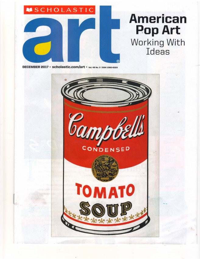
Having just received a promotional copy of Scholastic Art magazine’s December 2017 issue, entitled American Pop Art: Working with Ideas, I’m moved to comment. But there is so much wrong with it that I scarcely know where to begin.
A logical starting point, I suppose, would be the cover, featuring an Andy Warhol Campbell’s [Tomato] Soup Can (1964). What ideas, we might begin by asking, is it “working with”? In an article entitled “Ideas that Pop,” we’re told that Pop artists “found inspiration in daily life” and “presented complex and serious ideas about the world through the subjects they featured and the techniques they used.”
As for how a literal rendering of a single Campbell’s soup can conveys a “complex and serious idea about the world,” nothing is said. But Warhol’s 1962 Campbell’s Soup Cans—an installation of 32 framed canvases of single soup cans differing only in the names of the soups, and grouped side by side in four rows of eight each—is said to “reflect the abundance of choices a shopper see in any large grocery store.” By making them look “mass-produced” and displaying them this way, Warhol purportedly “points to a culture fueled by mass consumption.” That, then, would appear to be his “complex and serious” idea.
On another page, however, we learn that Warhol “claimed [he painted the soup cans] because he had eaten Campbell’s soup for lunch every day for 20 years.” Not what most people would call a “complex and serious” idea. We’re also told that Warhol “frequently had assistants produce his silkscreen prints in an assembly-line system”—in his New York City studio, dubbed “The Factory.” Indeed, while the aforesaid soup can pieces were oil paintings, the bulk of Warhol’s later work consisted of mass-produced silkscreen prints.
Most important is what we’re not told by Scholastic Art—that is, why Warhol adopted a minimally artistic, industrial approach for his work. Warhol himself made it abundantly clear, however. As he explained in an Art News interview with G. R. Swenson in 1963, he chose not to create paintings because he didn’t “love roses or bottles or anything like that enough to want to sit down and paint them lovingly and patiently.” He further confided that it was “threatening” to paint something “without any conviction about what it should be.” He used mechanical methods, he said, because he wanted “to be a machine.” Surely bizarre sentiments for a would-be artist. Yet they were entirely consistent with the zombie-like demeanor Warhol generally exhibited, leading clinical psychologist Louis Sass to compare his words and actions to those of a typical schizoid personality.1
No hint of such dysfunction is offered by Scholastic Art, however. Instead, we get this tidbit, reported without critical comment:
Warhol also made movies, but most were conceptual and without a narrative or plot (for example, he filmed a man sleeping for more than five hours).
Are students and teachers to regard that as serious movie-making?
Finally, there was Warhol’s approach to portraiture. Of his Self-Portrait (1966), we’re informed that he portrayed himself “more as a product than as an individual.” True. He also did so for his acclaimed celebrity portraits. But doesn’t that controvert the very point of a portrait? And shouldn’t teachers and students be made aware of that?
“Elevating the Everyday”
As for Pop artists in general, Scholastic Art credits them with “explor[ing] the mundane aspects of daily life” and thereby “elevating the everyday.” Works that “look like they belong in the pages of a magazine” or on “television commercials” (as the magazine notes) don’t “elevate the everyday” or “explore” anything, however. They merely replicate commercial trivia.
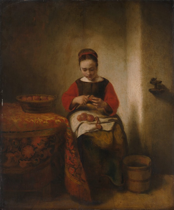
Nicolaes Maes, Young Woman Peeling Apples (ca. 1655). Oil on wood, 21.5 x 18 in. (54.6 x 45.7 cm). Metropolitan Museum of Art, Bequest of Benjamin Altman.
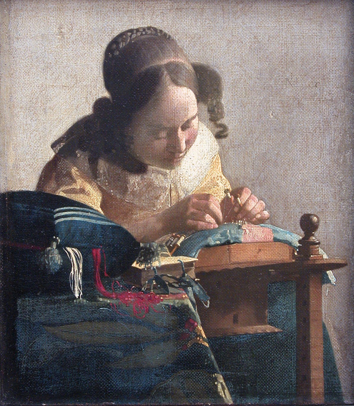
For examples of art that truly elevate the everyday, teachers might turn instead to seventeenth-century Dutch genre painting—works such as Jan Vermeer’s Milkmaid or Lacemaker, or the less-well-known Young Woman Peeling Apples by Nicolaes Maes, shown here. Such paintings elevate their subjects by sensitively depicting them in quiet concentration on simple everyday tasks. In so doing, they also convey a sense of what life was like in their time and place.
In contrast, Edward Ruscha’s Standard Station (1966) makes no “statement about contemporary culture” worth asking students about (as prompted by Scholastic Art caption for the image). It merely resembles a billboard sign.
Nor does Roy Lichtenstein’s Look Mickey (1961) “reinterpret an image from popular culture” in any significant sense. As reported, he created it only because his young son had challenged him to paint something “as good as” a Mickey Mouse illustration they were looking at together. All he did was greatly enlarge the image and make some minor formal changes such as simplifying the background and using dark outlines—nothing that substantially alters its significance. In fact, his paintings were little more than abstract formal designs to him. “I paint my . . . pictures upside down or sideways,” he once declared. “I often don’t even remember what most of them are about.”2
True, Lichtenstein’s work “grabs the viewer’s attention”—by its size alone—much as a billboard does. But does it hold one’s attention or prompt reflection the way the Dutch paintings cited above can? I don’t think so.
Also contrary to Scholastic Art’s assertion, Lichtenstein’s work scarcely “elevates an illustration from a children’s book to the level of high art.” If it “invit[es] viewers to think about what qualifies as art and why,” shouldn’t teachers guide their students toward recognizing the fundamental ways in which it differs from fine art? Moreover, shouldn’t they question whether “blurr[ing] the lines between popular culture and high art” constitutes progress—or should be rejected rather than embraced?
Further, if “the use of commercial art as subject matter in painting” is an earmark of Pop art—as Lichtenstein once said in an Art News interview—wouldn’t it be appropriate to point out that the subject matter of fine art has always been principally drawn from life itself, not from product ads or cartoon illustrations? And shouldn’t students be guided to think about the essential differences?
Pop Art in the Classroom
Teachers (and students) are attracted to Pop art for an obvious reason. It is much easier to create hands-on projects imitating Andy Warhol than Vermeer or Nicolaes Maes. A case in point is the Hands-On Project featured in Scholastic’s December issue. Entitled “Paint in Pop,” it aims to “use what you’ve learned about American Pop Art to explore repetition and variation.” But how much does that teach students about the distinctive cultural value of fine art?
Hanson Wu, Self-Portrait. Gold Medal for prints, 2017 Scholastic Art & Writing Awards. Scholastic Art, December 2017.
Similarly, the “Student of the Month” work is a Warhol-like self-portrait triptych. Awarded a Gold Medal in the 2017 Scholastic Art & Writing Awards, it was created by 14-year-old Hanson Wu, who digitally edited a photo of himself and then used it to produce three self-portrait prints varying only in color. Asked whether the images reflect his personality, Wu answered “Not really.” That, too, is in the spirit of Warhol. Happily, Wu doesn’t aspire to become a fine artist, however, just a graphic designer.3
The Underlying Truth
What teachers, students, and everyone else should know about Pop Art is the truth about the primary motivation behind it. The chief aim of the Pop movement was to challenge the Abstract Expressionists—not to make any “complex and serious” statements about contemporary culture. Thus the path the purveyors of Pop took was merely to do the exact opposite of whatever the Abstract Expressionists had done, no matter how trivial or meaningless the result was.4 Philosophers, critics, curators, and much of the public fell for it and welcomed it into the realm of “high art.” It’s long past time for everyone, especially art educators, to exercise greater discretion.
Louis A. Sass, Madness and Modernism: Insanity in the Light of Modern Art, Literature, and Thought (New York: Basic Books, 1992), 344–345. ↩
Roy Lichtenstein, quoted by Robin Cembalest in “Inside the Shrine With the Straight-Talking Artist,” New York Times, August, 24, 1998. ↩
It is worth contrasting Hanson Wu’s self-portrait with the very different one by Grace Lin, another Scholastic Art award winner—who was inspired by traditional art, not Pop. See the closing paragraphs of “How Not to Teach Art History,” For Piero’s Sake, August 7, 2017. ↩
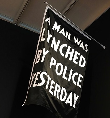
The first work encountered by a visitor to the Whitney exhibition epitomizes the shortcomings of recent “protest art.” It consists merely of a black flag emblazoned with the statement “A Man Was Lynched by Police Yesterday” in bold white letters. Created by Dread Scott (the pseudonym of arts activist Scott Tyler, b. 1965), the flag referred to the 2015 shooting of an unarmed black man, Walter Scott, by a white police officer in North Carolina. But one would have to read the wall label to learn that.1
I should add that Dread Scott first attained notoriety with his 1989 protest piece What Is the Proper Way to Display a U.S. Flag?, which he called an “installation for audience participation.” The participation it invited was for viewers to step on the American flag while writing their thoughts in the comments book displayed above it. That this participatory installation was part of an exhibition organized by Scott’s fellow students at the School of the Art Institute of Chicago tells you something about the caliber of art instruction at that institution. Yet degrees from such institutions are what qualify someone as an “artist” these days.
When Scott’s 1989 flag piece provoked a national furor, he claimed (perhaps disingenuously) that his intent “was not to desecrate the flag” but to “open up discussion about America, U.S. patriotism, and the . . . flag.” As is often the case with such “conceptual” installations, however, the piece was viewed quite differently by the public—not least, members of Congress. In any case, Senator Bob Dole, for one, was entirely justified at the time in referring to Scott as a “so-called ‘artist.’”
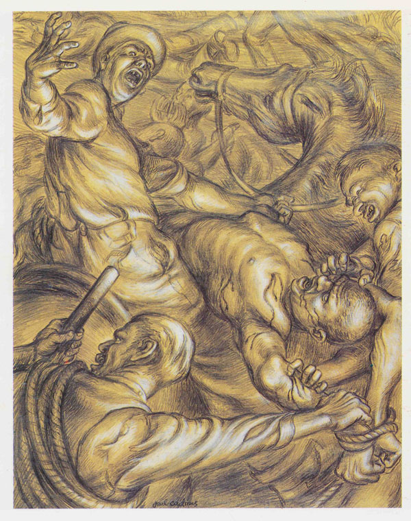
Paul Cadmus, To the Lynching, 1935. Graphite pencil and watercolor. Whitney Museum of American Art.
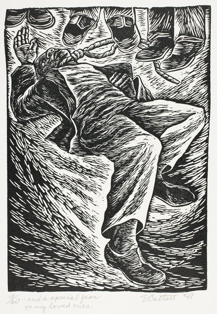
By the same token, Scott’s “A Man Was Lynched” flag is so-called art. Although it manages to trigger a momentary emotional response by Scott’s having substituted the negatively charged verb “lynched” for the blander but more precisely relevant term “shot,” it pales in comparison with the impact of a genuine work of art dealing with the same theme. For example, Paul Cadmus’s drawing To the Lynching (1935)—unlike Scott’s flag—chillingly embodies the brutality of a lynch mob. So, too, Elizabeth Catlett’s linoleum cut And a Special Fear for My Loved Ones (1946) starkly conveys the power of the lynchers and the helplessness of their victim.
Moreover, by representing the human dimension of such acts, these images transcend the particular circumstances of any single injustice to convey something more universal. That is what makes them art, in contrast with Scott’s mere verbal protest against one unjust event. Since both of these works are actually in the Whitney’s collection, why were they not included this exhibition? (The 1940 starting date could have easily been extended back five years to accommodate the Cadmus drawing.) Might it be that such works of genuine art would have revealed the relative feebleness of more recent protest pieces?
The vast majority of the works displayed at the Whitney, like so much “contemporary art,” rely heavily, if not exclusively (as in Scott’s lynching flag), on verbiage to get their message across. Those that employ imagery do so mainly through photographs—not through the arts of drawing or painting.
In a gallery devoted to Vietnam war protests, two whole walls comprise anti-war posters that make use of both words and photographs, as well as of some simple imagery. According to the docent I happened to hear, they were “not meant as art,” however, but were intended as “ephemeral” items to be posted on one’s dorm room wall, for instance, and then discarded. When I asked why they are being exhibited in a museum of art, she responded that we can now appreciate their “artistic qualities.” Just what those qualities are she did not say.
Nor are “artistic qualities” evident in Martha Rosier’s video piece Semiotics of the Kitchen (1975)—a mildly amusing feminist-inspired parody of Julia Child’s French Chef TV series. According to the Museum of Modern Art, the piece expresses the “rage and frustration of oppressive women’s roles.” Never mind that Child saw her role in the kitchen as anything but “oppressive.”
Perhaps the most absurd of the Whitney’s exhibits is Spaces and Predicaments [scroll down and click on thumbnail], comprising two abstract installations: Pyramid Up and Down Pyramid (1969), by Melvin Edwards, and Internal I (1977), by Senga Nengudi. The wall text informs us that these artists “chose personal, oblique, and allusive means to question how social spaces are made, engaged, and controlled.” Oblique and elusive might have been a more accurate description. Activist-artist David Hammons is quoted as saying that their work is “abstract art with a message.” I defy anyone to discern the message from the work alone, however. Like most contemporary work, it is unintelligible without a verbal gloss.
Animal Cruelty and Other “Conceptual” Aberrations
The Guggenheim’s Art and China after 1989 provoked heated public controversy even before it opened, thanks to a New York Times article previewing it (“Where the Wild Things Are: China’s Art Dreamers at the Guggenheim,” September 20, 2017). The main objection was to several “conceptual art” pieces involving the exploitation of live animals. As described by the Times, one was a seven-minute video showing
four pairs of American pit bulls tethered to eight wooden treadmills. The camera closes in on the animals as they face each other, running at high speed. The dogs are prevented from touching one another, a frustrating experience for animals trained to fight. The dogs get wearier and wearier, their muscles more and more prominent, and their mouths increasingly salivate.
Although animal cruelty was the main public concern, some of the many comments posted by readers in response to the Times article astutely questioned whether such work should even qualify as art.
As I noted on Facebook on October 12, the Guggenheim withdrew the three most offensive pieces. But far from acknowledging that such pieces were in fact morally reprehensible, the museum’s press release merely cited “concerns for the safety of visitors, staff, and participating artists after ongoing and persistent threats of violence in reaction to the incorporation of live animals in the creation of the works.” Moreover, it missed the larger point made by many Times readers, including me. Such “conceptual” pieces should not be regarded as art.
Yet the Guggenheim show consisted almost exclusively of such work. As I’ve indicated in “Is Ai Weiwei an Artist?” and argued more fully in Who Says That’s Art?, however, “conceptual art” is an entirely bogus genre. It began as a deliberate anti-art phenomenon, just one of the many bizarre postmodernist reactions against the dominance of Abstract Expressionism. In fact, its first theorist, Henry Flynt, is explicitly characterized as an “anti-art activist” (emphasis mine) on his authorized website.
Apart from the troubling fact that “conceptual” work invariably “defie[s] easy explanation” (as the Guggenheim itself acknowledged in its introductory wall text), the term falsely implies that what is distinctive about such work is that, allegedly unlike traditional art, it deals with ideas. Genuine art has always dealt with ideas, however. The difference is that in traditional work the ideas are embodied in intelligible imagery. They are conveyed directly.
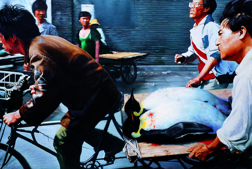
Wang Xingwei, New Beijing (2001), oil on canvas. Guggenheim Museum, New York.
Consider, for example, two of the few paintings that were included in the Guggenheim show. Wang Xingwei’s New Beijing (above) depicts a street scene in which two bloodied penguins lying supine on a wooden stretcher are being hurriedly transported by bicycle past two staring onlookers. The image has the impromptu quality of a news photo captured on the run. Created soon after Beijing had won its bid for the 2008 Summer Olympics, New Beijing is an ironic allusion to the tragic Tienanmen Square Massacre of 1989, in which peaceful protestors were brutally shot down by government forces. Also chilling is Liu Xiaodong’s Burning a Rat, showing two well-dressed young men standing on a river embankment, enjoying the spectacle of watching a rat die that they have set fire to. It is a disturbing embodiment of utter anomie.
Such works were notable exceptions to the countless protest pieces that have no relation to art, however.
Ai Weiwei Is Not an Artist
Protest is a vitally important recourse in any society short of a utopia. But absent art, it has no place in an art museum. That caveat applies to Ai Weiwei—China’s most famous “artist-activist”—no less than to the innumerable others in that category. Given Ai’s fame, of course, it is no surprise that his work was featured in the Guggenheim show. In addition to an ongoing documentary film series co-curated by him (Turn It On: China on Film, 2000–2017)—which included some of his own work—Ai’s nearly lifesize photographic triptych Dropping a Han Dynasty Urn (1995) filled a large wall. According to The Art Story website, this piece “demonstrates his show-stopping conceptual brilliance.” It strikes me as a rather heavy-handed gesture in more ways than one, however—whose political message was vitiated amidst tangential speculations regarding the actual value of the crockery involved.2 In any case, it isn’t art any more than Marcel Duchamp’s “readymades” (a chief source of inspiration for Ai since his years as an art student in the U.S. in 1981–1993) are art.3
More effective as political protest but even farther removed from the realm of art was Ai’s most acclaimed instance of anti-government activism, his Sichuan Earthquake Names Project—prominently featured at the Guggenheim. Heartrending videos of survivors testifying to the loss of loved ones in the face of bureaucratic evasions and irresponsibility were displayed alongside a list of the thousands of victims identified by the project.
Moving though this testimony to tragic loss and monumental wrongdoing was, it constitutes a species of documentary reportage, not a work of art. Curators and museumgoers alike should recognize the difference.
Notes
Scott has said that his flag was inspired by one used (without the words “by police”) by the National Association for the Advancement of Colored People (NAACP) in the 1920s and ‘30s, when the lynching of blacks by white mobs was a major problem in the south—a substantially different situation from the 2015 case of a man shot by a police officer when he evaded arrest following a traffic stop (although deeply troubling aspects of that case led to the officer’s conviction). And the NAACP surely didn’t regard its flag as art. ↩
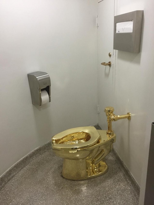
Isn’t it sad that Nancy Spector, chief curator of the Guggenheim Museum, can’t tell the difference between a work of art and a toilet? Here’s how she blogged about Cattelan’s America, “the 18-karat gold, fully functioning toilet that was installed at the Guggenheim for nearly a year in a long-term, sculptural performance of interactive art”:
Like all of Cattelan’s most complex works, this sculpture [Spector’s term, not mine] is laden with possible meanings. There is the art-historical trajectory, from Duchamp and Manzoni [of Artist’s Shit fame] to more contemporary artists [whose work] traffics in scatological iconography. The equation between excrement and art has long been mined by neo-Marxist thinkers who question the relationship between labor and value. Expanding upon this economic perspective, there is also the ever-increasing divide in our country between the wealthy and the poor that threatens the very stability of our culture. Cattelan explicitly comments on this fact by creating what he called “one-percent art for the ninety-nine percent.”
When the artist [her term, not mine] proposed the sculpture in mid-2015, Donald Trump had just announced his bid for the presidency. It was inconceivable at the time that this business mogul, he of the eponymous gilded tower, could actually win the White House. When the sculpture came off view on September 15, Trump had been in office for 238 days, a term marked by scandal and defined by the deliberate rollback of countless civil liberties, in addition to climate-change denial that puts our planet in peril.
Since then, of course, the Trump presidency has been marked by a few other things that a fair-minded critic might note—such as massive tax cuts, a growing GDP, the lowest Hispanic and black unemployment rates in years, expulsion of the Isis caliphate, the rollback of regulations that were crippling businesses, and so on.
But Spector is among those whose hatred of the president is so ingrained that they are constitutionally unable to see anything about him in a positive light. She is in the news now because an insulting email she sent to the White House in September, offering the toilet’s loan, has come to light. And who would expect The Washington Post to refrain from reporting such a brilliant gesture of political protest, stale though it might be at this late date?
Leaving politics aside, let’s return to Cattelan’s “sculptural performance of interactive art.” While it was on display in one of the Guggenheim’s unisex bathrooms, visitors were invited to use it “to commune with art and with nature,” as Spector so cleverly put it.
If the toilet is indeed of solid 18-karat gold, its monetary worth is anywhere between $1,474,592 and $2,527,872. A civic-minded museumgoer might therefore muse that the sum would have been better put toward reducing “the ever-increasing divide in our country between the wealthy and the poor that threatens the very stability of our culture”—a matter of such keen concern to curator Spector.
Be that as it may, whether of 18-karat gold or mere workaday porcelain, a toilet (to paraphrase Gertrude Stein) is a toilet is a toilet—not a work of art.
Jillian Steinhauer, Senior Editor of Hyperallergic.
Google “Ayn Rand’s theory of art,” and the second item you will find [as of this writing] is an article with that title in the online magazine Hyperallergic. Published in September 2012, the article—which prominently cites the book I co-authored on Rand’s theory—has been known to me for some time. But it is such a scurrilous hatchet job that I didn’t want to dignify it with a response.
What changed my mind? The recent discovery that the article’s author, Jillian Steinhauer (Hyperallergic’s senior editor), was honored by the U.S. chapter of the International Association of Art Critics (AICA-USA) with its Best Art Reporting award in 2014. “Prizing excellence in writing,” AICA-USA also designated Hyperallergic the Best Blog.
So it may be worth dissecting Steinhauer’s piece after all, to see what presumably passes for “excellence in writing” in today’s artworld.
To begin with, after being alerted by an abstract painter named Abigail Markov to “the hefty 539-page treatise” What Art Is: The Esthetic Theory of Ayn Rand, Steinhauer “couldn’t quite bring” herself to “buy the book”—or even, I would add, to consult a copy in the New York Public Library. Instead, she relies on “excerpted bits” and chapter summaries that were published online.
Starting, reasonably enough, with “the most basic question of all: what is art?” Steinhauer manages to come up with the following “key takeaway” from What Art Is Online. In her words:
Rand sees the primary purpose of art as “nonutilitarian and psychological in nature” and says that its cognitive function is “to bring man’s fundamental concepts and values ‘to the perceptual level of his consciousness’ and allow him ‘to grasp them directly, as if they were percepts.’”
To my amazement, Steinhauer actually concurs: “OK, fair enough. I can get with that.” The problem for her “begins when you flip the question and ask what isn’t art.” She simply can’t understand why “Rand is horrified by the art establishment’s assertion that anything can be art if the artist (or a critic) says so.” And she can’t abide Rand’s view that representational painting, drawing, and sculpture are the principal forms of visual art.
Steinhauer then proceeds to list some of the artworld luminaries and genres called into question by Rand’s theory (“things that Rand says are not art, from all artistic fields, not just visual”)—few of them directly excluded by Rand, in fact. Had Steinhauer deigned to read the book, she would have recognized that it was Louis Torres and I—not Rand herself—who had drawn such exclusions, based on Rand’s theory. In any case, like others challenged by our revisionist viewpoint, Steinhauer simply rejects our conclusions—our exclusions from the realm of “art”—without considering (much less rebutting) the evidence and arguments behind them.
Among the excluded genres noted by Steinhauer are “any and all abstract art.” By implication, she finds this absurd. But does she consider what “fundamental concepts and values” (a key part of Rand’s theory that she “can get with”) are communicated by abstract painting or sculpture? Hardly. Nor does she venture to reconcile “American Indian artifacts and other examples of ‘craft’”—another item on the list of exclusions—with Rand’s view of “the primary purpose of art as ‘nonutilitarian and psychological in nature’” (which she also says she agrees with).
Predictably, Steinhauer has nothing good to say about our “critique of spurious postmodernist genres (from ‘pop art,’ ‘conceptual art,’ and ‘performance art’ to ‘installation art’ and ‘video art’) and acclaimed postmodernist ‘artists,’ including Andy Warhol, Robert Rauschenberg, Jasper Johns, Roy Lichtenstein, Cindy Sherman, and Bruce Nauman, Nam June Paik, Chuck Close, and Matthew Barney.” Yet she is again mum on the question of how she thinks these examples would fit Rand’s definition of art—which “she can get with.”
Finally, Steinhauer is dismissive of the book’s Appendixes—in particular, Appendix B: Artworld Buzzwords. As if nailing the ultimate absurdity of Rand’s theory, she cites our listing of “such innocuous verbs and adjectives” as “challenge,” “confront,” “explore,” and “quirky,” as well as “the artist,” “emerging artist,” “contemporary,” “gallerist,” “make,” “new,” “object,” and “visual culture.” But she fails to note our countless excerpts from recent arts coverage showing how those buzzwords are used to legitimize “cutting-edge” work that many reasonable people, including genuine art lovers, find beyond the pale of art.
Contra Rand, Steinhauer stands by the “quirky, abstract political web installations made by emerging artists and shown by a handful of new gallerists that explore our society’s visual culture and challenge our notions of objecthood.”
In her closing paragraph, the award-winning critic—whose specialty is the “intersection of art and politics”—can’t resist the following reference to the 2012 presidential campaign:
At this point it might be relevant to mention [Mitt] Romney’s comments about axing the National Endowment for the Arts if elected (in the book, Rand [no, Torres and Kamhi] calls the NEA “a dubious model” for arts support) or the influence of Rand on vice presidential candidate Paul Ryan . . . but I just can’t do it. I can’t take Ayn Rand’s “esthetic theory” seriously enough for that.
Hmm. . . . Could Steinhauer’s political animus explain why she couldn’t bring herself to read the book about Rand’s theory to begin with and discover what it actually says? If so, she’s surely not alone in today’s artworld—though better minds than hers [more] have found that theory well worth taking seriously.
Some time ago, I received a message through my website contact form that was headed “Looking for Possibility to Translate Your Book into Chinese.” Needless to say, I was delighted.
After introducing himself as Chen Guang Wang, a Chinese émigré in his third year as a student of Visual Art at the Emily Carr University of Art and Design in Vancouver, the writer explained:
Art has been my lifelong endeavor, yet I have always wondered why I could not understand most Contemporary Art. About a year ago, I Googled “why I can’t understand conceptual art” and found Aristos, with your article “Understanding Contemporary Art.” I also learned of your book Who Says That’s Art?. I was thrilled to see that someone has been dedicated to this issue for decades, and that your writing is very solid.
Observing that art in China is in the same confused condition as here and that people are “thirsty” for anything new from the West, he added that “after 100 years, we might be . . . at a turning point,” with a return to representational work. In such a climate, he suggested, there should be interest in a Chinese edition of Who Says That’s Art?.
In a subsequent message, Chen Guang wrote that he was eager to translate the book because “most people are perplexed by ‘conceptual art,’ ‘readymades’ and ‘abstract art.'” In his view, my “strong argument” against such work “definitely needs to be spread.”
Given the extensive work required to translate the entire book and publish a Chinese edition, however, we agreed that it would be prudent to explore the potential interest for such an edition. A sample chapter—Chen Guang’s translation of the book’s Introduction into Simplified Chinese—is therefore published here. Chinese readers interested in seeing more should contact the translator.
The opening next week of the major exhibition Michelangelo: Divine Draftsman & Designer at the Metropolitan Museum of Art1 prompts me to post the following brief item about a little-known side of this master.
The awe-inspiring grandeur of Michelangelo’s work earned him the reverent epithet of “Il Divino” among his contemporaries. It is therefore remarkable to discover that this most profoundly serious of artists also possessed a wicked sense of humor. In 1525, on learning that Pope Clement wished him to stop his work on the Medici library and chapel to build a Florentine colossus some 80 feet high (made of blocks and placed at the corner of the Medici garden loggia)—to honor the Medici family and rival the David—Michelangelo responded in mock seriousness through a letter to an intermediary in Rome, observing:
The colossus does not suit the corner, because it would take up too much of the road.
However, on the other corner, where the barber’s shop is, it would, in my view, turn out much better, because the piazza is in front and so it would not cause so much trouble with the street. And then, perhaps because removing the shop wouldn’t be tolerated, thanks to the income it provides, I’ve come to think that the figure could be sitting down, and that the seat could be made so high that if the work were made hollow inside, which could conveniently be done using blocks, the barber’s shop could go underneath, and so the rent would not be lost. And in order that the shop may, as now, have somewhere for the smoke to escape, I am thinking of giving the statue a horn of plenty in its hand, all hollow, to serve as a chimney.
Then if I have the statue’s head hollowed out, like the other members, I also think I can derive some benefit from that, because there is on the piazza here a huckster, a great friend of mine, who has told me privately he would make a fine dovecote inside it. Another idea has occurred to me that would be even better, but it would be necessary to make the figure very much bigger; yet it could be done, seeing that the towers are made up of blocks. This is that the head should serve as the bell-tower for San Lorenzo, which badly needs one. And then, with the bells flying round inside and the sound coming out through the mouth, the colossus would appear to be howling for mercy, and especially on feast days, when the bells ring out more often and the peals are louder.
Needless to say, the pope was not amused. But when renewed efforts failed to engage the sculptor in the proposed project Clement eventually dropped his request for a colossus.
For more on this hilarious epistle and its many irreverent references, see page 182 of George Bull’s Michelangelo: A Biography (from which it is quoted), as well as the account in The Last Judgment: Michelangelo and the Death of the Renaissance, by James O’Connor.
Notes
This truly “once-in-a-lifetime” exhibition illuminates the central role played by drawing in this incomparable genius’s work as sculptor, painter, and architect alike. See the press release for Michelangelo: Divine Draftsman & Designer.↩
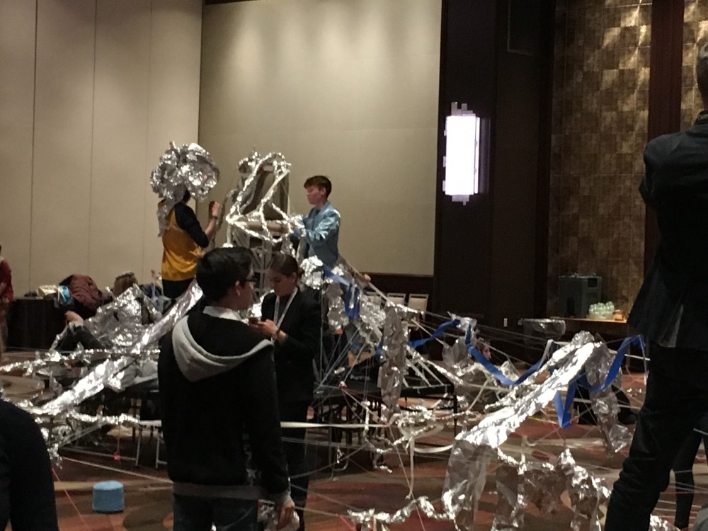
Areas for Action, led by “experimental artist” Oliver Herring, National Art Education Association conference, New York City, March 4, 2017.
This week, September 10–16, is National Arts in Education Week—an annual event established by Congress in 2010 to celebrate the value of the arts in education and gain broad support for it. On what grounds could any civilized member of society object?
The answer is that the value of arts education largely depends on the quality of the works that are presented for study. And the sad truth is that far too many arts advocates and educators have uncritically embraced the “avant-garde” and virtually any work that has made a mark in the contemporary art world, regardless of its intrinsic merit or its reception by ordinary people, including many serious art lovers.
Most pronounced in the field of visual art education, this lamentable tendency was all too evident at the annual conference of the National Art Education Association (NAEA) earlier this year, attended by more than 7,000 art teachers from around the world.
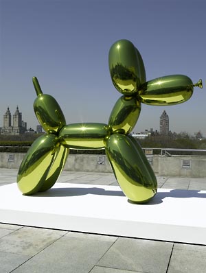
The NAEA’s official statement of purpose refers to the “power of the visual arts to enrich human experience and society.” But the contemporary examples featured at this year’s convention provided little enrichment. They ranged from inanities such as the “Balloon Dogs” of artworld superstar Jeff Koons to a chaotic “open-ended participatory performance, improvisatory sculpture, and real-time collaborative artwork” overseen by “experimental artist” Oliver Herring (above), in the free-for-all spirit of a 1960s Happening.
Scarcely any sessions dealt with exemplary art of the past. Nor were contemporary artists included who have chosen to perpetuate the venerable tradition of Western painting and sculpture. Yet their art is far more likely to appeal to a broad public than the “cutting-edge” anti-traditional work touted by today’s cultural establishment and accepted by far too many who are involved in art education.
The problem is not limited to the visual arts. A prominent example is Richard Kessler, a longtime arts education advocate who became dean of the world-class Mannes School of Music in 2011. An ardent champion of the avant-garde, he has departed from Mannes’s historically conservative stance by establishing a performance space for “experimental music” at its present parent institution, The New School.
Kessler regards the experimentalist John Cage (1912–1992) as a “great” composer, whose “most important work”—his notorious piece 4’33” (in which a pianist sits motionless at a piano for that amount of time)—can teach us something. According to Kessler, it can teach us to “critically engage with silence as a renewable pedagogical act.”
Such woolly thinking should give pause to advocates aiming to incorporate the arts into the STEM (science, technology, engineering, and math) educational movement. Might the non-arts counterpart of John Cage in STEAM be a scientist sitting before a blank page or an empty test tube, critically engaging with emptiness as a renewable pedagogical act?
The avant-garde mentality of many arts education advocates is further muddled by political aims and assumptions. Kessler—who formerly headed the Center for Arts Education (a nonprofit organization dedicated to promoting arts education in New York City’s public schools)—once dubbed me “the Joe McCarthy of Art Education.” Why? Because I had dared to suggest, in the Wall Street Journal, that the primary aim of art education is not to achieve the elusive goal of “social justice” but to teach about art.
Moreover, as I had clearly implied, a “performance piece” praised by a leading art educator in which the purported artist distributed specially equipped sneakers to assist illegal immigrants waiting to cross our Mexican border was an instance of political activism, pure and simple—not a work of art.
Kessler argued that I was exaggerating the politicization of art education. As he saw it, only a “handful of art professors” were teaching about social justice—not enough to merit concern. The latest NAEA conference has proved him wrong.
A plethora of sessions were devoted to achieving “social justice” through art education, with little thought given to the caliber of the purported art involved. One session actually advocated shifting the focus of art criticism to “analyzing social justice issues” outright. Future art teachers, it recommended, should use art criticism “to foster critical thinking . . . about pedagogy and social justice issues.”
As I’ve argued in Who Says That’s Art?: A Commonsense View of the Visual Arts, the proper and urgent subject for critical thinking in art education in today’s culture is the question of what qualifies as art and why—not the complex socio-political questions involved in issues of “social justice.” Such issues enter into the thorny realm of politics and are entirely beyond art teachers’ professional purview. But the question of what art is and why we value it transcends politics.
Nearly fifteen years ago, I published an article asking “Where’s the Art in Today’s Art Education?” [full text]. The question remains. It merits particular consideration during National Arts in Education Week.












![Campbell’s [Tomato] Soup Can](https://s3-us-west-2.amazonaws.com/collections.lacma.org-images/remote_images/ma-19261-WEB.jpg?9BxiBP_tdfV4swOBkGXBEuvgNdT.QuK9)